


If you are still treating thumbnails as an afterthought in 2025, you are missing views—and dollars—left on the table.
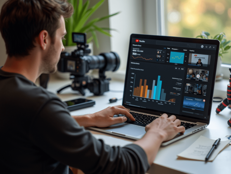
Being a visual strategist and full-time YouTube creator, I have firsthand evidence of how the appropriate thumbnail may 10x the performance of your video. You might have the top material in the universe, but if your thumbnail lacks appeal, no one will click.
In this book, I am detailing the precise methods I (and many top creators) apply—purely via thumbnail optimization—to regularly achieve greater CTRs, more views, and better video momentum.
Let’s get started.
Why Thumbnails Will Be Essential for YouTube Success in 2025
The YouTube algorithm in 2025 is even more merciless than in earlier years. It gives videos with great watch time and high click-through rates (CTR) top priority. Before deciding in a split second, your thumbnail and title are all a viewer sees.
Your initial impression comes from thumbnails, not just decoration.
Should individuals not click, YouTube will not promote your video regardless of the quality of the content. Conversely, if your thumbnail catches them right away, you have already won half the struggle.
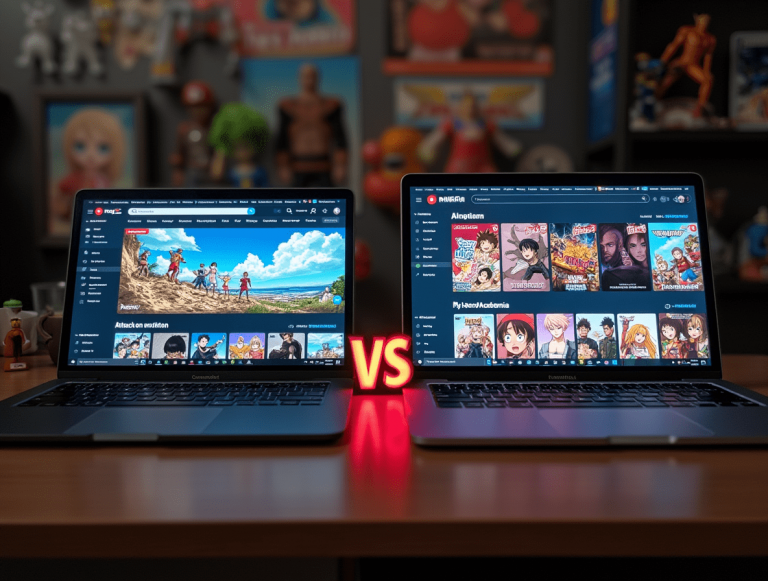
Standing out visually is especially crucial in 2025 as Shorts, long-form, livestreams, and podcasts all vying in the same environment.
Today’s CTR Standards and the Reasons Thumbnails Directly Affect Video Reach
Regarding CTR benchmarks in 2025, this is necessity knowledge:
- 2%–5% CTR: Typical performance
- 5%–7% CTR: Strong, aggressive performance
- 7%–10%+ CTR: Outstanding performance (especially for big channels)
If your videos are consistently below 4%, your thumbnails most likely need much better focus.
Why this matters: The YouTube algorithm relies heavily on CTR. When people click, YouTube thinks your video is intriguing and begins to suggest it to more viewers. That’s how videos spiral into popularity.
The Psychology Driving Good Thumbnails
Click-converting thumbnails appeal to fundamental human psychology. You can triumph if you know what causes people to feel, pause, or question.
Here is what is effective:
- Contrast: Strong contrast lets your thumbnail stand against YouTube’s hectic interface. Consider light items on dark backgrounds—or vice versa. It’s about distinction, not vivid colors.
- Emotions: Genuine, strong emotion seen on faces usually surpasses flat images. Surprise, terror, wonder, and delight—if it’s genuine and strong, it works.
- Curiosity: You need not give all away. Actually, withholding information creates interest. Create visual displays that inspire inquiries.
- “What happened here?”
- “Why should he be surprised?”
- “What’s just beyond frame?”
Design Guidelines Raising Click-Through Rate
Beyond psychology, let’s discuss design. These sensible guidelines always enhance CTR:
- Use strong, legible type.
- Limit yourself to two or fewer fonts.
- Choose large, sans-serif typefaces (Bebas Neue, Montserrat, Anton).
- Stay away from script fonts; they are challenging to read on little displays.
- Opt for a limited color scheme.
- Employ strong, contrasting colors in consistent brand.
- Steering clear of oversaturation: it appears amateurish.
- Streamline the Composition:
- Concentrate on one important theme—that maybe a face or an item.
- Darken or blur the backdrop to highlight the foreground.
- Use strokes, shadows, or outlines to define components.
- Rule of Thirds: Arrange your subject and text such that the viewer’s eyes naturally follow them. Don’t just center everything; instead, establish balance and conflict.
Thumbnail Dimensions and Resolution
- Minimum: 1280 x 720 px
- Maintain under 2 megabytes.
- 16:9 aspect ratio should be used.
- Save as PNG or JPG.
Resources for Designing YouTube Thumbnails in 2025
There is a tool for your expertise level whether you are a novice or expert:
- Canva: Ideal for novices. Thousands of templates and simple drag-and-drop capability. Ideal for rapid iterations.
- Photoshop: Best for professionals. Greatest control over effects, illumination, and composition.
- Figma: Ideal for version control and team workflows. Quick, cloud-based design.
- Photopea: An internet-based, free Photoshop substitute.
- Snappa / Picmaker: Special thumbnail tools aimed at YouTube artists. Fast exports and built-in templates.
Avoid paralysis over tools. Select one and begin testing.
Thumbnail A/B Testing Techniques
Official A/B testing (Experiments) from YouTube was launched in 2023; it’s a game changer.
How to use it in 2025:
- Experiment with thumbnails under Content > Video Details.
- Upload up to three different versions.
- YouTube chooses the winner and presents them automatically to several viewers.
Top strategies:
- Test exceedingly varied ideas—not only little adjustments.
- Run tests for at least seven days.
- Along with CTR, watch time per impression should be checked.
External tools:
- TubeBuddy provides split-testing solutions with thorough analytics.
- Thumblytics for visual A/B testing and performance heatmaps.
Typical Thumbnail Errors to Avoid
I’ve made every one of these blunders so you do not have to.
- Too Much Text: Readers who have to read will scroll past. Keep writing to a bare, powerful minimum.
- Cluttered Design: Too many components equals misunderstanding. Simplicity allows one to change well.
- Low Contrast: Thin thumbnails seem to fade into the background. Create separation by means of lighting and contrast.
- Misleading Clickbait: You might get clicks, but you would ruin retention and damage trust. Use inquiry rather than falsehoods.
- Inconsistent Branding: Every video style changing perplexes viewers. Maintain a same appearance.
Case Studies: Thumbs Up Virally
Let us analyze several successful models from 2025 creators slaying it.
- Mr. Beast: I Gave Away a Private Island
- Close up, face of great astonishment.
- Clear visual of the island.
- The thumbnail and title fit exactly.
- Ali Abdaal: I Quit Being a Doctor.
- Clean text: “Why I Quit.”
- Unhappy face expression + stethoscope in hand.
- Great emotional weight + inquiry.
- Ryan Trahan: Surviving on $0 for 30 Days
- Grimy, rough visual appeal.
- Good dramatic background in the picture.
- Clearly presents hardship visually.
Every one of these thumbnails:
- One glance tells a narrative.
- Matches the tone and subject of the video.
- Works together with the title.
How to Create Thumbnails Suitable for Your Niche and Audience
Various thumbnails expectations abound in different niches. Know your lane.
- Gaming:
- Bright hues.
- Face expressions + in-game components.
- Large, audacious responses.
- Teaching / Tutorials:
- Strong visuals of results or instruments.
- “Before/after” arrangements.
- Text such as « How to…» or « 5 Tips».
- Vlogs / Lifestyle:
- Feelings + honest gatherings.
- Text establishing a narrative (“I Moved Out…”).
- Business / Finance:
- Minimalist, polished design.
- Reliable presentation (not over-the-top).
- Symbols, charts, headlines, money.
Study leading channels in your area and reverse-engineer their approach.
How Titles and Thumbnails Help to Improve Performance
Your thumbnail and title should be teammates, not twins.
Together, they ought to:
- Make a gulf of curiosity.
- Establish a obvious promise or narrative.
- Steer clear of saying the very same thing.
“I Tried Waking Up at 4AM for 30 Days”
Thumbnail text: “It Broke Me.”
This mix draws the audience in with a question: What happened when they tried this?
Steer clear of putting the entire title on the thumbnail. Utilize the thumbnail to strengthen the hook rather than duplicate it.
Redesign to Realign: Final Thoughts
If you really want to develop on YouTube in 2025, you should start treating thumbnails as the high-impact lever they actually are.
Review your past videos. Look at which thumbnails lacked performance. Start testing then rethink them using the techniques presented above.
First, remember that YouTube is a visual platform. Your content will not have the opportunity it deserves if your thumbnails are not earning the click.
This is about clarity, curiosity, and great design, not clickbait.
You have what it takes to stand out. Go create something people would click right now.
Frequently Asked Questions
Q: For YouTube thumbnails, what would be considered a decent CTR? A: Though typically varied by niche and audience size, a “good” CTR usually:
- Average is 2%–5%.
- Strong is 5%–7%.
- 7%–10%+ is great. Tighter audiences make smaller channels sometimes have better CTRs.
Q: What steps should I follow in 2025 to create standout thumbnails? A: Concentrate on:
- Strong contrast.
- Emotional expressions.
- Good composition.
- Readable, strong text.
- Evaluating several designs to see which performs best.
Q: Should I include text in my thumbnails? A: Yes, but limited. Support curiosity with short, strong text (2–5 words max). Avoid duplicating your title or cramming perfect sentences into the picture.
Q: Do YouTube rankings depend on thumbnails? A: Certainly. Directly related to CTR—which informs YouTube whether your video is worth promoting—thumbnails matter. Better thumbnails equal better CTR, more impressions equal better ranking.
Q: Am I able to change thumbnails following a video publication? A: Indeed, you ought to if your video falls short. Changing the thumbnail can help to resuscitate a flatlining video and increase CTR gradually. For optimal results, combine it with a title change.